A Sense of Place at Congress Hall
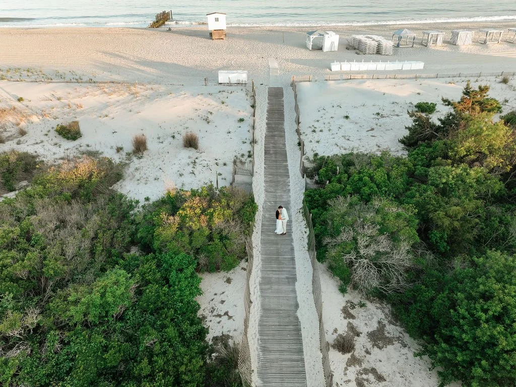
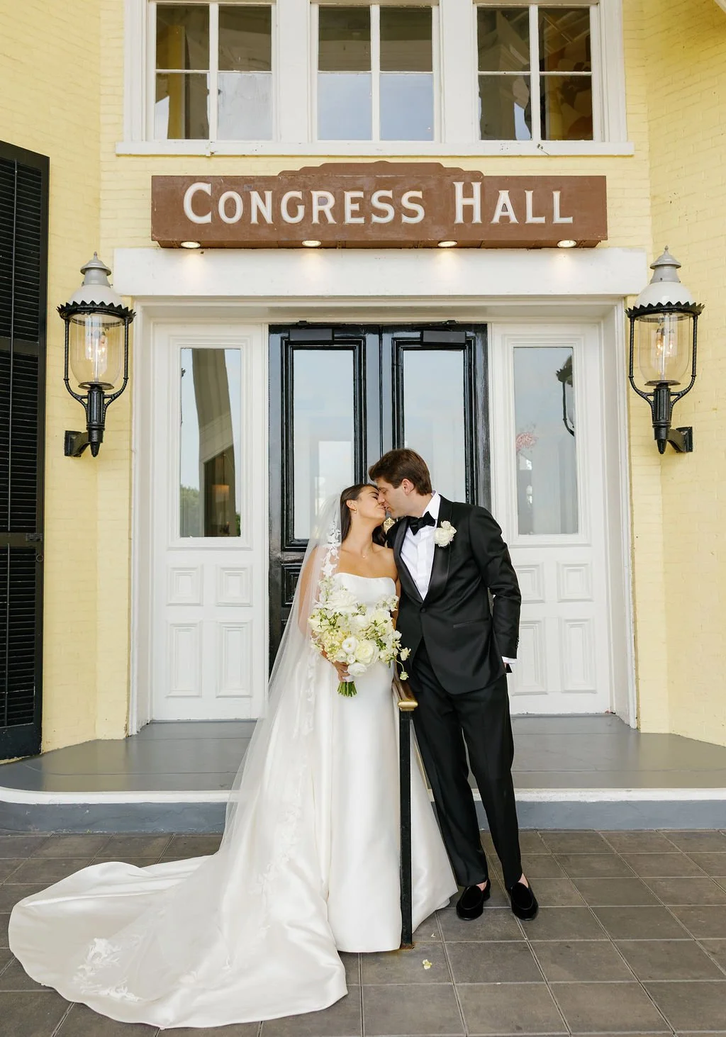
There is something about Congress Hall in Cape May that gives you an immediate sense of place. It is coastal, of course. But it is also historic, polished, relaxed, and full of personality. For Lauren and George’s June wedding, the goal was to reflect that setting without turning the stationery into a collection of obvious beach references. In other words: beachy, but not beachy. That idea became the foundation for the entire stationery story.
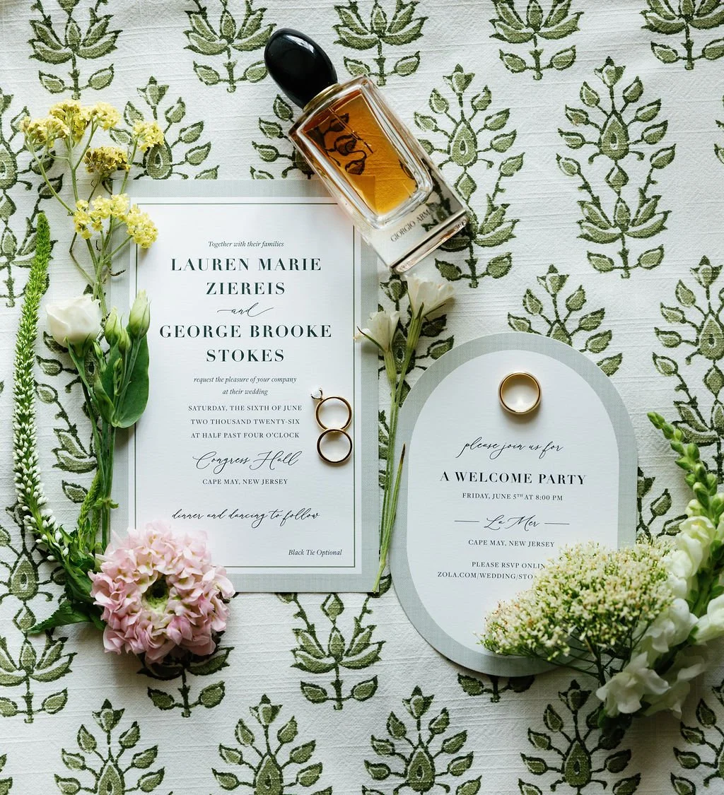
Lauren and George began with the Abigail suite from my Curated Collection, which gave us a strong starting point for the invitations. From there, we made thoughtful changes to make the design feel more personal to them and more connected to Congress Hall. One of the most important additions was a custom green ticking pattern. We used it first as an envelope liner and as a border detail on the invitation itself. It immediately brought in that breezy, coastal feeling, but in a way that felt classic rather than thematic. There were no shells, waves, anchors, or literal beach illustrations. The pattern simply gave us a sense of softness, movement, and place. That became one of my favorite things about this suite: the venue influenced the design without completely dictating it.
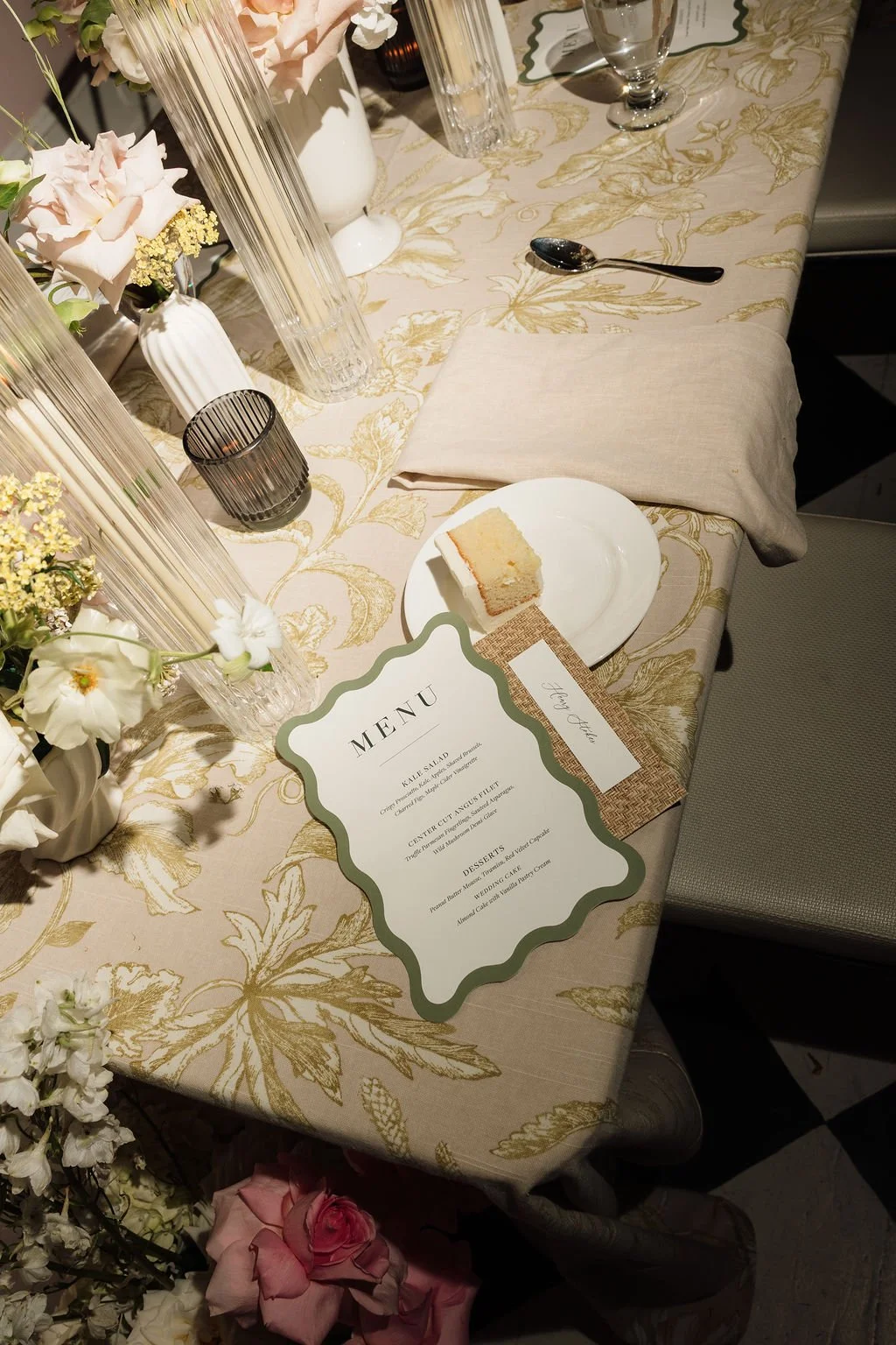
As we moved into the wedding-day details, that same philosophy continued. Working alongside Designs by Daisy, we leaned further into natural textures and materials. Rattan, woven stock, and fabric brought dimension to the paper pieces and helped the stationery feel connected to the overall environment. The ticking pattern also moved beyond paper. We had custom fabric printed using the same stripe and used it to create fabric-covered frames for some of the wedding-day signage. That small shift, from printed pattern to actual textile, made the design feel more layered and intentional. It is also a good example of something I think about often when designing a full stationery story: not every element needs to match, but the pieces should feel like they belong together. The invitations introduced the visual language. The wedding-day details expanded it.
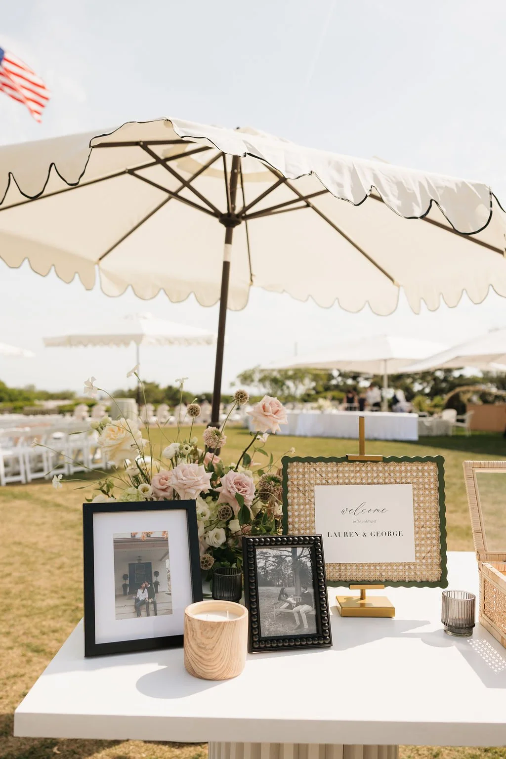
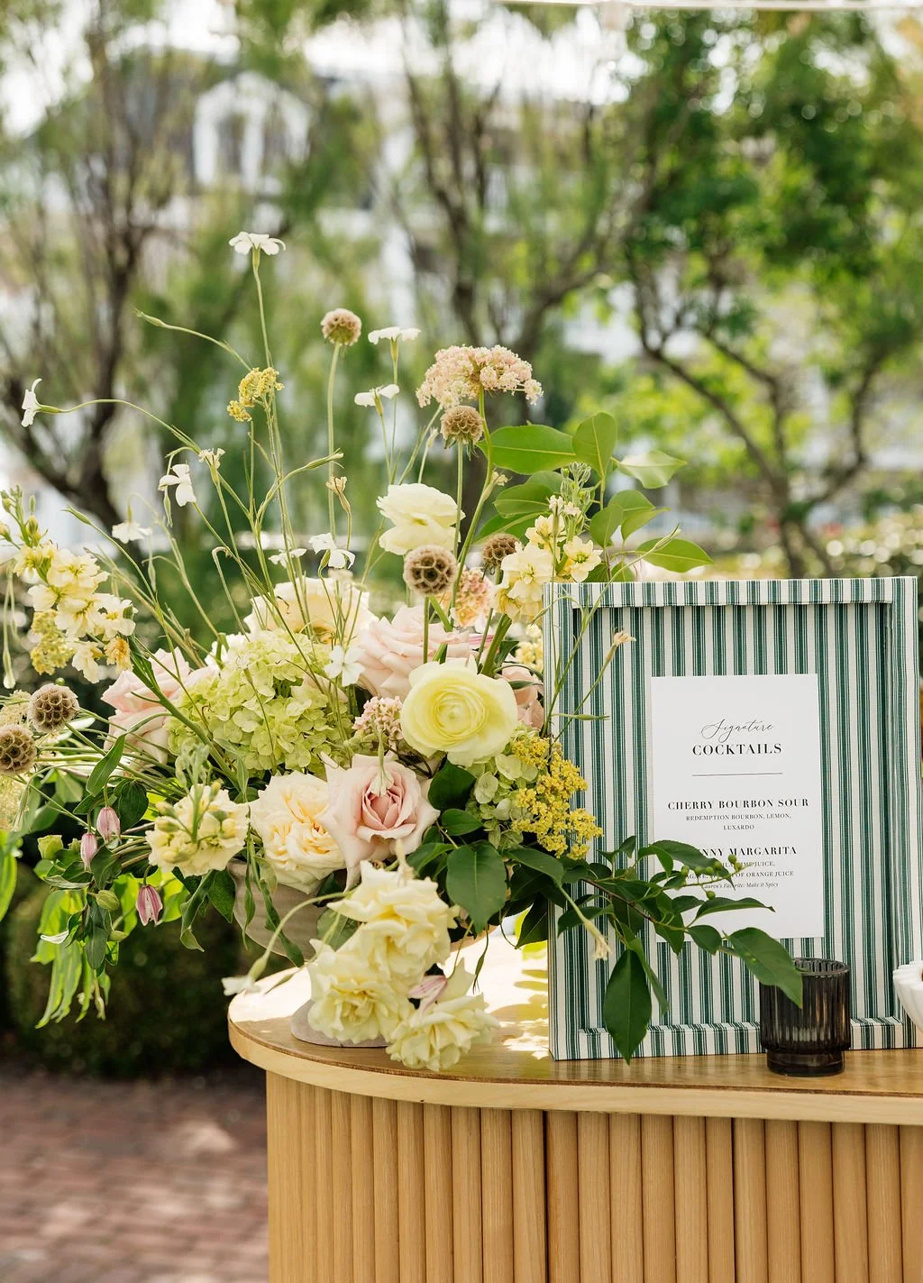
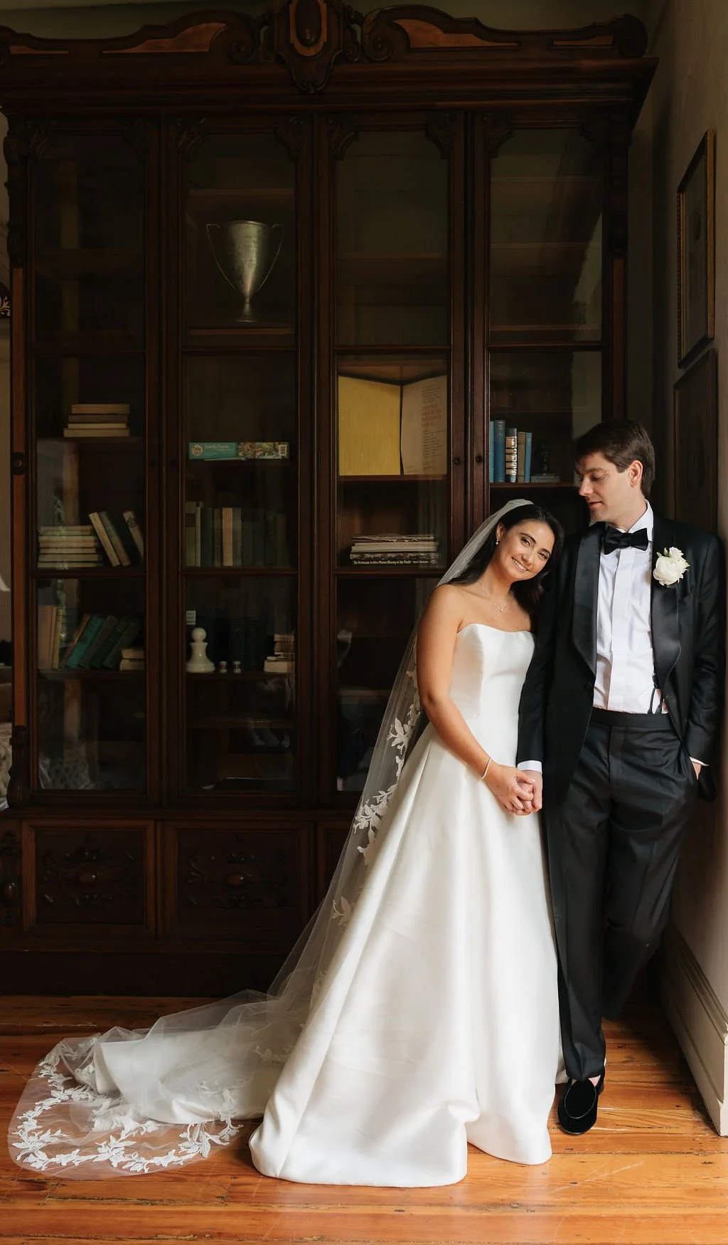
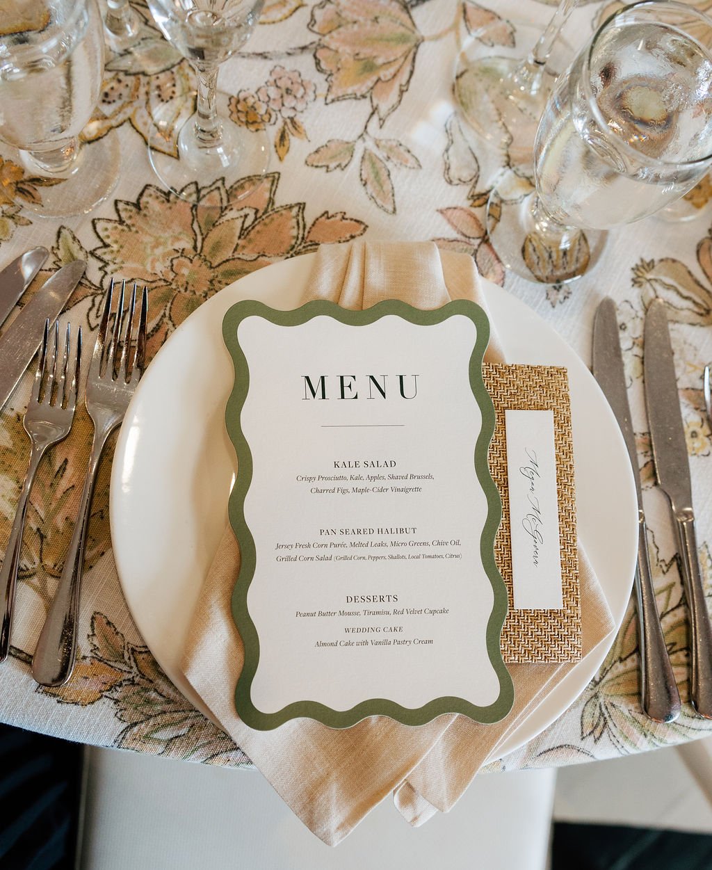
Pattern appeared in different ways. Texture became more important. Natural materials gave the designs warmth. The palette remained soft and grounded. Nothing felt copied and pasted from one piece to the next, but there was still a clear connection from the moment guests opened the invitation to the moment they arrived at Congress Hall. That is always the goal. A cohesive wedding does not need one motif repeated everywhere. In fact, I usually prefer when it does not. Instead, I like to identify a few strong design ideas (a pattern, a material, a color, a shape, a type treatment) and allow those ideas to evolve throughout the celebration. For Lauren and George, the result felt relaxed, refined, and entirely appropriate for Cape May.
Coastal, yes. But never overly beachy.
And that distinction made all the difference.
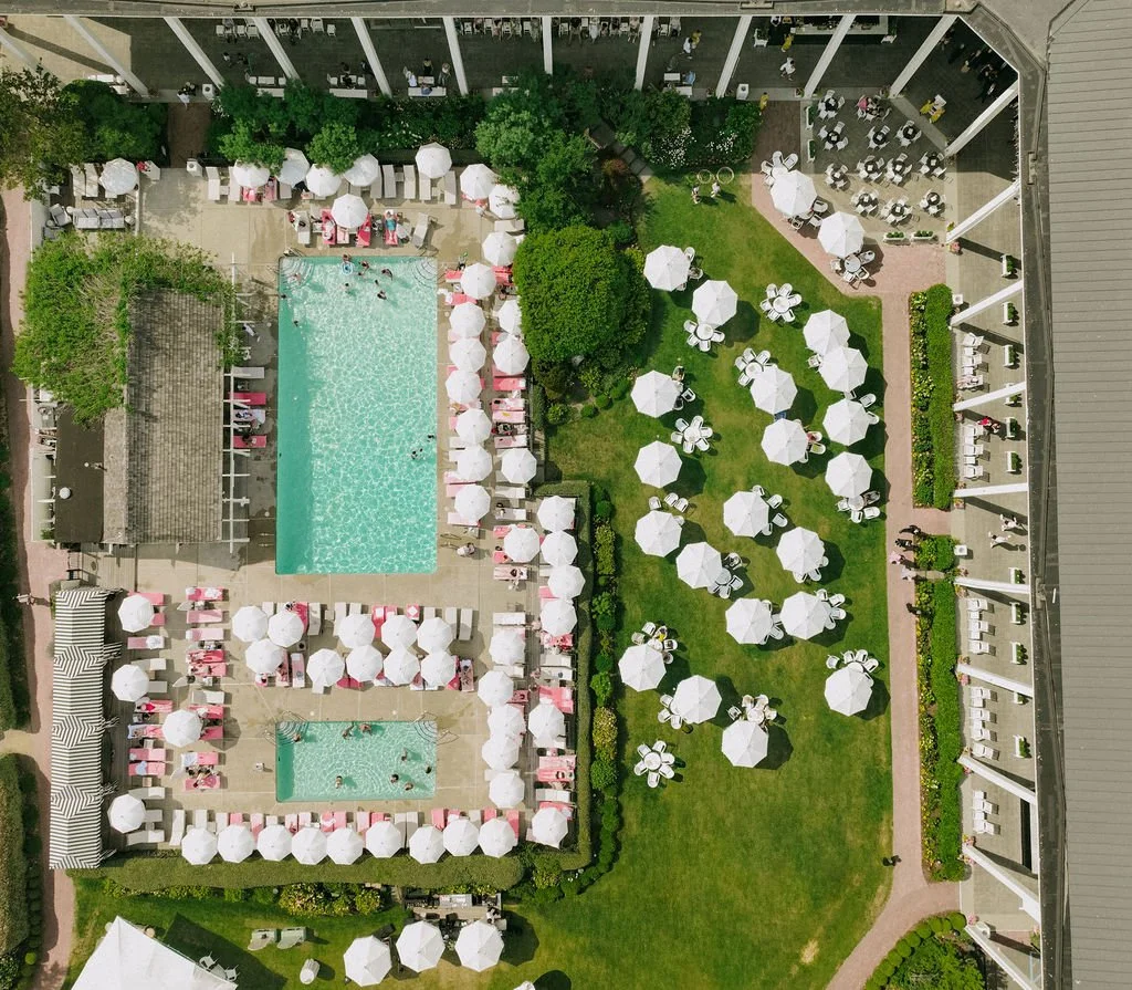
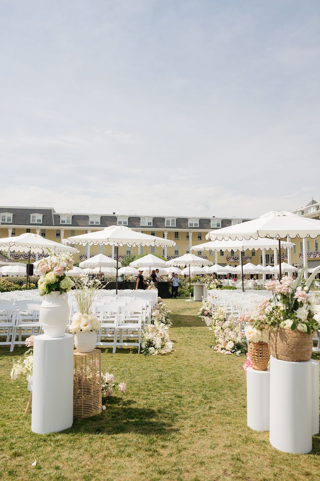
A wedding like this is always the result of many talented hands. I’m so grateful to have worked alongside this wonderful team to bring Lauren and George’s celebration at Congress Hall to life.
Planning & Design: Designs By Daisy Events
Venue: Congress Hall Cape May, NJ
Photography: Rae Photography
Florist: Betina's at Parkview
Band: Sydney - EBE Talent
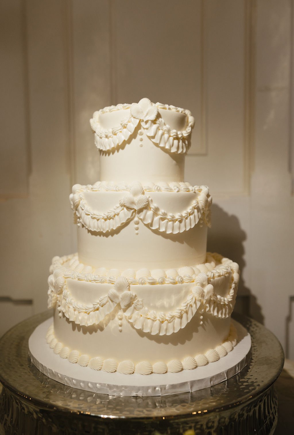
Cake: The Bake Works
Hair & Makeup: Mash Up Beauty
Seating Chart & Rentals: Rosier Event Rentals
Linens: Stradley Davidson & BBJ Latavola
Stationery & Tabletop Signage: Stone Hill Paperie
Planning a wedding at a venue with a strong sense of place? I’d love to help you create stationery that feels connected to the setting, thoughtful in every detail, and entirely your own.
Explore the Curated Collection or inquire about custom wedding stationery to begin.