
How to Photograph Wedding Invitation Flat Lays with Intention
Wedding invitation flat lays have become a familiar part of the wedding gallery and when they’re done well, they can be absolutely beautiful. But as a stationer, I’ll admit: I have opinions. A well-designed invitation suite is not just “paper.” It is often one of the first intentional design decisions a couple makes for their wedding. It introduces the tone, color palette, level of formality, print methods, materials, artwork, and guest experience long before the wedding day arrives. So when it comes time to photograph that suite, the goal is not simply to make something pretty. The goal is to photograph it thoughtfully.
I reached out to several photographer friends and asked for their best advice on shooting wedding stationery flat lays - especially when there are specialty print details, layered materials, meaningful artwork, or design elements that deserve to be seen. Their responses were practical, generous, and refreshingly honest. Here’s what stationers wish more photographers knew, with insight from some very talented people behind the camera.
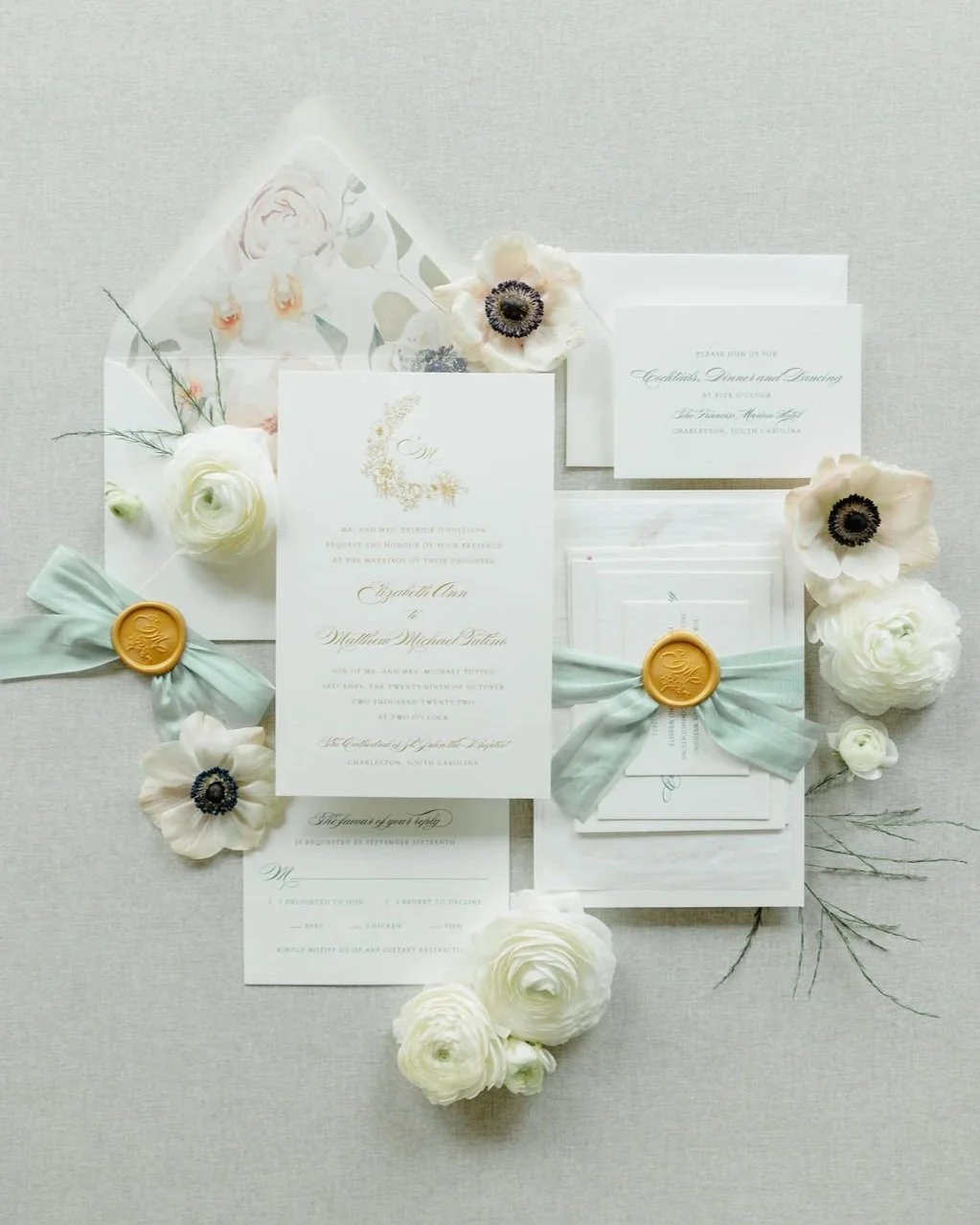
Photo by Kimberly Hidore Photography
Start with the Story
Before styling a flat lay, begin with the invitation itself. Is the suite classic and structured? Loose and romantic? Modern and architectural? Garden-inspired? Historic? Minimal? Colorful? Formal? The styling should respond to the design, not fight against it.
Juliana Tomlinson put this beautifully: “A classic, structured suite cannot be styled like a casual garden party, and vice versa.”
She went on to explain that she approaches the flat lay as “the opening chapter of their story, not just one more thing to check off the list.” That is exactly it. The invitation is the first piece of the wedding experience most guests receive. It sets expectations. It offers clues. It says, “This is what this celebration will feel like.” A flat lay should honor that.


Less Is More
This was the most common theme from every photographer I heard from: edit, edit, edit. A beautifully designed invitation suite can often speak for itself. It does not need to be buried under ribbon, greenery, shoes, perfume bottles, loose blooms, ring boxes, heirlooms, stamps, trays, and every styling object within arm’s reach. Kristy Chatelain of Kristy May Photography recommends a “less is more approach,” whether the composition is clean and structured or intentionally loose and layered. The key is that the placement should feel deliberate.
Julian Ribinik said it this way: “The flat lay that looks beautifully composed is usually the one where someone made a decision and committed to it. The mistake is trying to include everything. Edit ruthlessly.”
And Kimberly Hidore echoed the same idea: “A beautiful invitation suite can speak for itself, and doesn’t need a lot of ‘trinkets’ or other things to feel complete.”
The best flat lays usually have restraint. They allow the suite to breathe. They give the viewer enough visual context to understand the story without overwhelming the actual invitation.
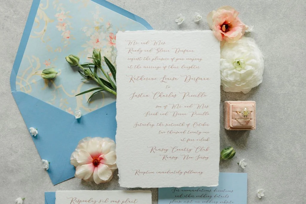
Photo by Kimberly Hidore Photography
Stationer Hot Take: If It Isn’t Thoughtful, It Doesn’t Belong
A beautiful prop is not automatically a meaningful prop. That is the distinction.
The question should not be, “Is this pretty?” The question should be, “Does this belong with the invitation, the couple, and the overall wedding design?”
A ribbon used in the suite? Yes. A spare bloom that reflects the wedding florals? Lovely. A vintage stamp that complements the palette? Wonderful. A linen texture that echoes the tablescape? Absolutely. A meaningful ring, heirloom, or detail tied to the venue or couple? Beautiful. But random props that have no relationship to the invitation or wedding design can quickly become distracting. Shoes and perfume, for example, usually do not belong in an invitation flat lay unless they are somehow connected to the stationery or the larger design story. They are beautiful wedding details, but they are not automatically stationery details. Let the shoes have their own moment. Let the fragrance have its own moment. And let the invitation suite have room to breathe.
Kimberly Hidore made this point clearly: “I typically create 3 flat lays on a wedding day: the stationery, the bride’s details, and the groom’s details. The first tells the story of the invitations suite and how the guest experience was initiated. The bride and groom each get their own moment with their own details.”
That is such a helpful way to think about it. Not everything needs to live in one frame. Separate flat lays can tell separate parts of the story with much more clarity.
Also, Kimberly said it, so I’m going to lovingly repeat it: “Also, no shoes with the stationery!” Amen.

Show the Specialty Printing
When a couple invests in specialty printing, they are paying for more than ink on paper. They are paying for the shine of foil. The impression of letterpress. The raised detail of embossing. The quiet depth of blind debossing. The softness of handmade paper. The texture of velvet liners. The touch and dimension that make the suite feel extraordinary in person. The photograph should help us see that.
If it’s shiny, show the reflection. If it’s raised, show the depth. If it’s pressed into the paper, show the shadow.
Kristy Chatelain emphasized the importance of lighting when photographing texture: “If you want to highlight texture, side or angled lighting will accentuate it.”
William Adwin also pointed to window light as one of the best tools for photographing details, whether the light is soft and indirect or direct and more dramatic. His point was that both create directional light, which helps reveal dimension and texture.
Flat light, especially light coming from the camera position, tends to hide the very details that make specialty printing special.
Julian Ribinik was especially direct on this: “Get close and get raking light. Letterpress and embossing are essentially invisible in flat, even light.”
Susan Stripling explained it beautifully too: “Letterpress and embossing are tiny dents pressed into the paper, and lit straight on they vanish. You want a soft light raking across so every impression catches a shadow.”
Foil requires a slightly different approach. Susan noted that foil needs something soft to reflect back, and that she tilts the card until it begins to glow.
This is the kind of care that makes a difference. A straight overhead image may show the overall layout of the suite, but it will not always show why the suite felt special in person. For stationers, planners, and couples who invested in those details, that matters.
Get Close
A full-suite flat lay is important, but it should not be the only image. Photographers should also capture the details within the details: the foil catching light, the letterpress impression, the embossing, the handmade paper edge, the envelope liner, the wax seal, the ribbon texture, the monogram, the venue illustration, the custom artwork, the tiny meaningful elements that may not be obvious from a wide shot.
Kimberly Hidore recommends getting both the “wide shot” and the “close up shot”: “Pull back and get it all in context, and then go in and pay attention to the details within.”
That is especially important for suites with custom artwork or premium print methods. A couple may have chosen a watercolor illustration of their venue, a monogram based on family initials, a liner pattern inspired by the architecture, or a subtle blind deboss that can only be seen from a certain angle. Those details deserve to be documented.
Make the Text Readable
Not every stationery photo needs to look like a perfectly legible scan. Some images can be atmospheric, angled, cropped, or focused on texture. But if every image makes the wording impossible to read, something has been missed. The typography, wording, layout, hierarchy, and spacing are all part of the design. They were considered carefully. They help communicate formality, tone, timing, and guest experience.
Susan Stripling said one common mistake is shooting wide open so that one card is sharp and everything behind it becomes “mush.” Her advice: “Stop down and let the design be readable.”
Juliana Tomlinson also noted that shooting too wide open, beautiful as it may be for portraits, can soften too many of the details in a flat lay. This is such an important technical distinction. Invitations are not portraits. They are designed pieces with information, texture, and detail that need enough depth of field to be understood. If the viewer cannot read the invitation or see the print method, the image may be beautiful, but it may not be useful.
Commit to the Composition
A flat lay does not have to be perfectly symmetrical. It also does not have to be loose and organic. Either approach can work beautifully. The problem is when it feels accidental.
Kristy Chatelain noted that photographers can approach a flat lay with careful alignment for a stricter composition, or commit to a looser composition with intentional overlapping and angled pieces. The important word is commit.
Julian Ribinik said the strongest flat lays are usually the ones where someone made a clear decision.
Susan Stripling offered similar advice: “Go flat or commit to an angle.”
Kimberly Hidore added that if you are using right angles, make sure they are truly square. And if you are angling pieces, make sure that choice feels purposeful. The invitation suite should not look like it is sliding off the table.
Think About Dimension
Flat lays do not actually have to feel flat. Risers, layering, envelope flaps, ribbon, wax seals, handmade paper, deckled edges, and overlapping pieces can all create depth - when used with intention.
Kimberly Hidore recommends using risers to create different layers and add dimension to the composition. This can help the image feel more elevated and less like paper arranged on a surface. The key, again, is thoughtfulness. Dimension should support the suite, not turn it into a pile of pieces.
Use the Right Tools
A few technical notes came up repeatedly from the photographers:
Use a lens that does not distort the suite.
Consider using a tripod for alignment and consistency.
Watch your aperture so important details do not fall out of focus.
Do not overexpose and wash out the texture.
Use directional light to reveal depth.
Use a macro lens when photographing foil, embossing, handmade paper, or velvet details.
Choose a clean, polished backdrop or styling mat.
Kristy Chatelain mentioned that not using the right lens, shooting too wide, and skipping a tripod can all create issues. Kimberly Hidore pointed out that a proper mat or backdrop makes a big difference, especially when the alternative is styling on concrete or another surface that makes the details feel messy or unpolished. The surface matters. The color matters. The texture matters. Everything in the image should be helping the suite, not competing with it.
Give Yourself Enough Time
Beautiful flat lays take time. They require finding the right light, arranging the pieces, adjusting the angles, checking focus, refining props, and capturing both wide and close-up images.
Kristy Chatelain gave very practical advice here: “Leave a lot of time. If you don’t have enough time on the wedding day for the invitation, get a copy of the suite and other items and take home.”
This is a generous reminder that wedding day timelines are not always friendly to detail photography. If the room is chaotic, the light is terrible, or there simply is not enough time, it may be better to photograph the suite before or after the wedding day rather than rushing through it poorly.
Susan Stripling also recommended getting there early, asking the planner to set the suite aside, and shooting it while your corner is still calm. That calm matters.
When I’m working on a wedding, I typically reach out to the photographer a few weeks beforehand and offer to send a full invitation suite in advance, so they can plan ahead and photograph the pieces when the timing and light are best.
Ask What Matters Most
This may be one of the simplest and most helpful things a photographer can do:
Ask.
Ask the planner. Ask the stationer. Ask the couple if they are especially attached to a particular element.
Is there custom artwork?
A meaningful monogram?
A hidden illustration?
A family crest?
A special print method?
A liner inspired by the venue?
A ribbon color pulled from the florals?
A detail the couple agonized over for months?
Julian Ribinik shared that when shooting stationery details, they often go directly to whoever designed or sourced the pieces and ask what should be highlighted. “When you shoot for the person who actually cares about the work, you get a much better image.” That line is worth remembering.
The couple may or may not care deeply about the flat lay in the moment. They are, understandably, focused on getting married. But the planner, stationer, floral designer, photographer, and publication team may all care about how those details are documented because those details help tell the full visual story of the wedding. A quick question can make the images exponentially better.
Photograph the Details in Use, Too
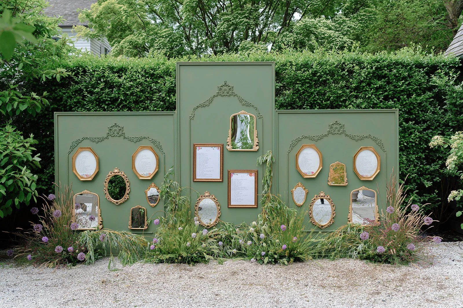
The flat lay is only one part of the story. Menus on the table, escort cards arranged for guests, programs in baskets, signage in place, cocktail napkins at the bar, matchbooks, welcome notes, table numbers, seating displays; these are all part of the designed guest experience. Kristy Chatelain noted the importance of photographing details both styled and as they are being used on the wedding day. That way, clients can see the pieces individually and understand how the design carried through the event. This is especially valuable for planners and stationers because it shows cohesion. It connects the invitation suite to the wedding day itself. The flat lay introduces the story. The day-of details complete it.


Photos by Alex Knight Studios
A Few Final Flat Lay Reminders
Let the paper breathe.
Choose props because they belong, not because they are pretty.
Use flowers thoughtfully, not automatically.
Please, no shoes unless they are truly part of the stationery story.
Show the specialty printing.
Use directional light.
Get close.
Make the text readable.
Stop down when needed.
Use a clean backdrop.
Ask what matters.
And, as Susan Stripling so perfectly said: “Also, iron the ribbon. I mean it.”
Thank You to the Photographers
A heartfelt thank you to the photographers who generously shared their perspective for this post:
Kristy Chatelain of Kristy May Photography
Juliana Tomlinson
Julian Ribinik
Kimberly Hidore
William Adwin
Susan Stripling
Your insight helps make this more than a stationer’s wish list. It turns it into a thoughtful, practical, and collaborative resource for photographing wedding stationery with more care, clarity, and intention.
I’m especially grateful because every photographer included here is someone whose work I deeply admire. These are artists who understand that wedding photography is not just about documenting what was there, but noticing what mattered - the story, the feeling, the craftsmanship, the quiet details, and the people behind them. I respect their work tremendously, and I respect them just as much as humans.
Because at the end of the day, the best flat lays are not the ones with the most objects. They are the ones where every detail belongs.